Need
The company had been in the sector for years, but its site did not clearly tell a new visitor what it sells. A corporate customer had to look at the site and think “a serious company”.
Solution
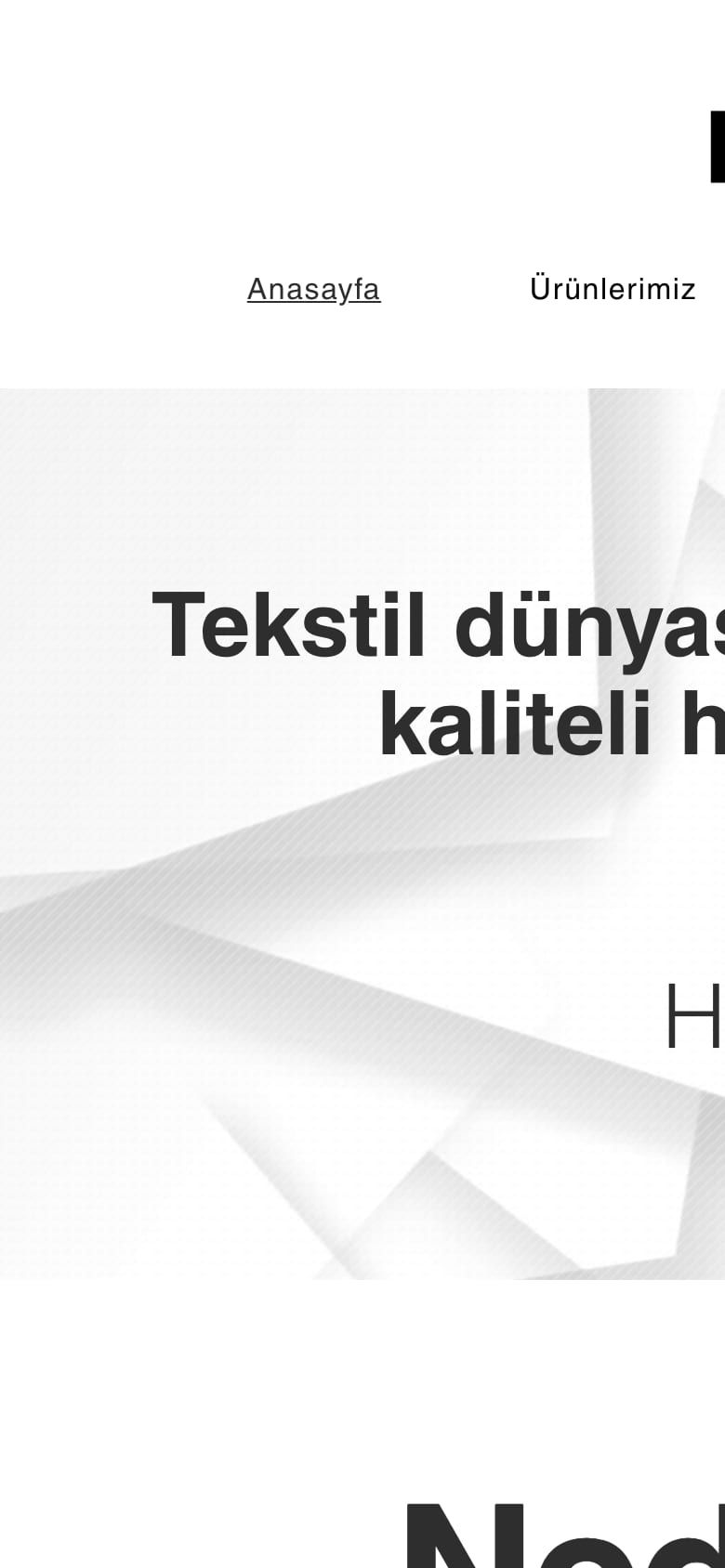
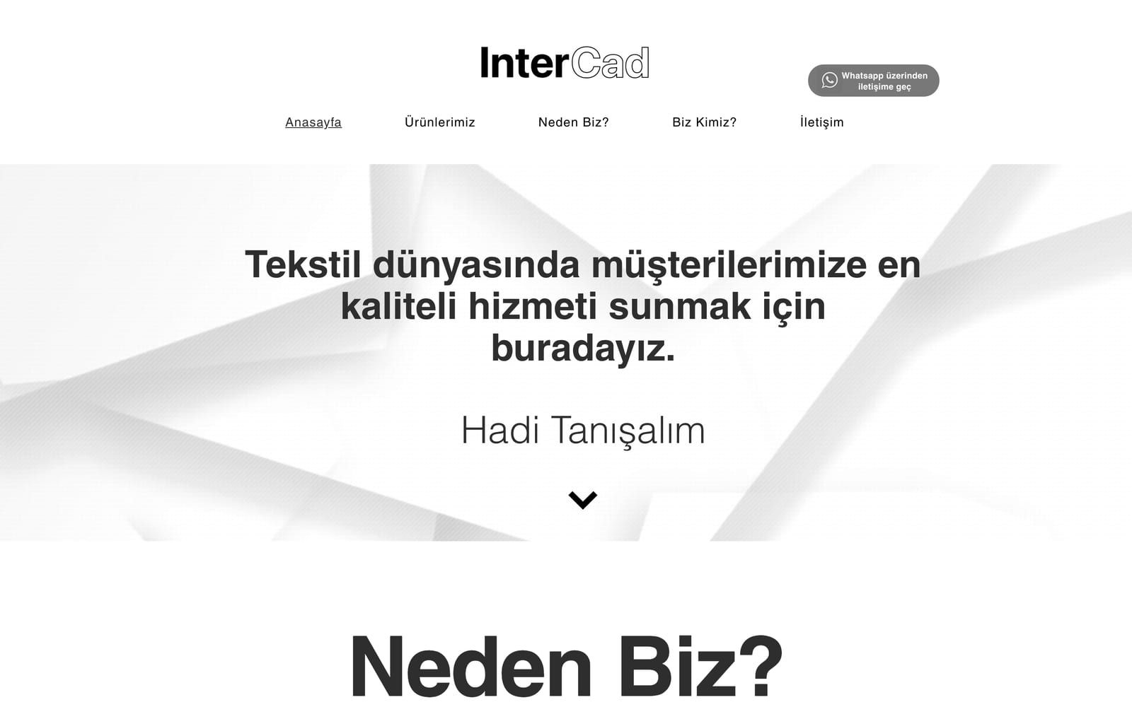
Products and services separated under short headings, experience and customer focus moved to the first screen, a one-step contact form. Colours and typography stayed faithful to the existing identity.
Result
A new visitor understands what the company does in thirty seconds; the sales team shares the site comfortably before meetings.